Blue Phoenix
BLLUE PHOENIX | PHASE I | THE AVIDXCHANGE BUSINESS CHALLENGE
33% of closed, lost opportunities when a product gap was the reason, were the result of the lack of purchase order (PO) features & $613B in total market opportunity for payments.
What’s a purchase order?
A purchase order is an official order issued by a buyer to a seller. It has information on the specific products or services ordered as well as the quantities and the prices that were agreed upon.
It is used by a buyer to place an order and is issued before delivery. An invoice is issued by a seller using invoicing software after an order is delivered. It defines the amount the buyer owes for the purchased goods and the date by which the buyer needs to pay.
THE PROPOSED SOLUTION
Deliver an AvidXchange Purchasing Solution to serve the needs of AvidXchange’s core and emerging markets customers so we can win more purchasing deals
Align to customer and market needs in our core and targeted emerging markets with a focus on user experience before we start building features
Decouple existing product features (back-end code) to allow for standalone and rapid development
Identify, prioritize, and remove existing tech debt over time
HOW DID WE GET THERE? | A DESIGN THINKING APPROACH
Focus on providing deep, meaningful engagement w/customers
Connect with target users in a different way to reveal true pain points through qualitative customer interviews:
Spent time with customers to understand the requisition process from start to finish
Used that information to address those needs and gaps in current workflow
The interviews informed a new UX/I through an iterative design and testing methodology which led to a final new UX design
Feedback received around existing UI confusion informed the new UX design standards which addressed color contrast, font sizes and existing workflow issues
TECHNICAL CONSTRAINTS
•New UX requires an overhaul of the existing front end implementation of AvidSuite
Lack of global styling [CSS & HTML]
New UX requires dedicated front end UX/I developers for entire AvidBuy which also impacts the rest of AvidSuite
The front end expert resources at AvidXchange are allocated and committed to a different initiative
RESEARCH OBJECTIVES & APPROACH
•Listen to our customer’s current procurement process and pain points they have on our products to help devise future solutions to resolve these issues
•Create Personas around our Requisition user base
•Conducted 10 Customer Interviews
•6 Ariett Platform Customers (Ariett is a purchase order solution AvidXchange offers as separate software as part of an acquisition)
•4 AvidXchange Platform Customers (customers of the AvidBuy application)
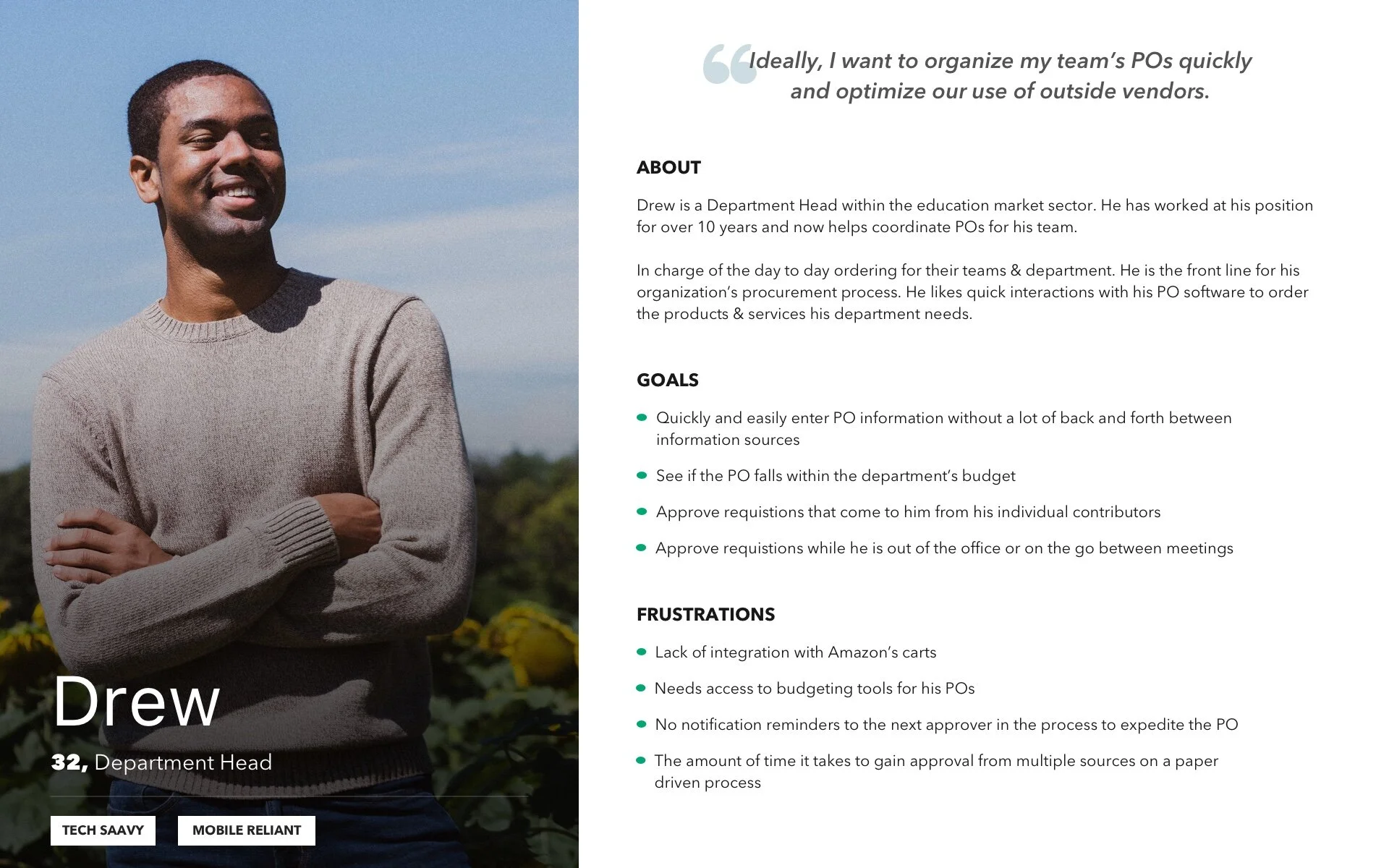
PERSONAS
•4 Procurement Buyer Personas were derived from the 10 customer interviews that the team performed.
KEY FINDINGS
•Our technical language toward specific functions does not match up to terms that our users are using [i.e. Punchout, Ship To Code(s)] - we will need better alignment of terminology between products
•Many of our customers, especially on Ariett, are unaware of some processes & features available to them
•Budget & Punch Out features are the most asked for features on the AvidBuy feature
•Customers spoken to use department heads/manager leads to create the requisitions
•The majority of Ariett’s user base spoken to use Punch Out & Budgeting - fewer use Supplier Catalog
•A standard use case has emerged
•Better visual language to customers required to help resolve confusion on pre-existing features
•Overall need a better workflow for POs to Invoices
Popular Features
These are the features that customers are using and/or asking for.
KEY FINDINGS | PRODUCT NEEDS
•Punch Out
•Budget Tracking
•Supplier Catalog
•Enhanced Reporting & Dashboards
•Better workflows surrounding flipping Purchase Orders to Invoices
Additional User Research:
Design Audit & Heuristic Evaluations
In conjunction with surveys and qualitative interviews, the UX team performed and completed a Design Audit in the current AvidBuy/AvidSuite product as well as Heuristic Evaluations of our top competitors.
PUNCH OUT USER TESTING | RESEARCH OBJECTIVES & APPROACH
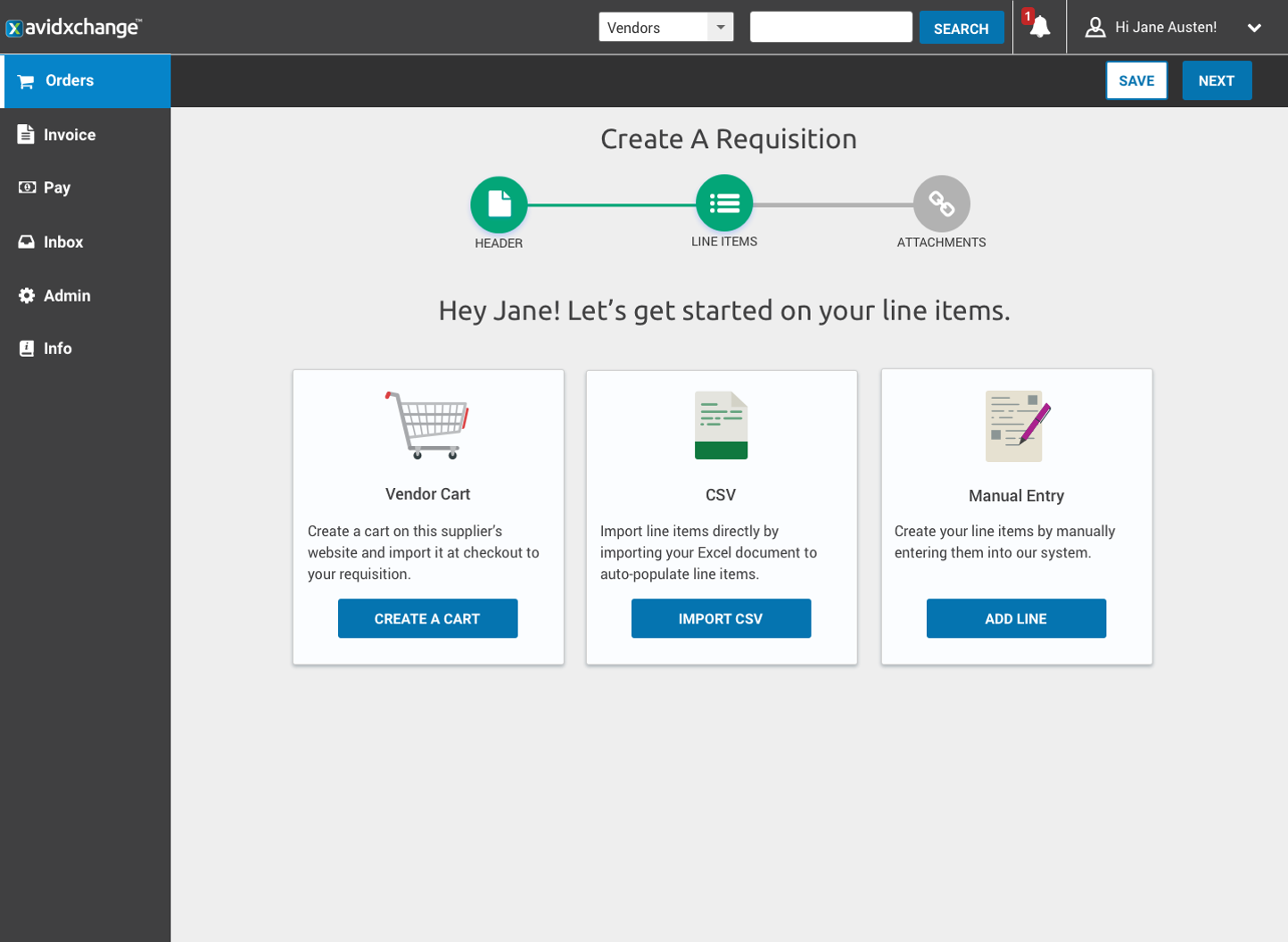
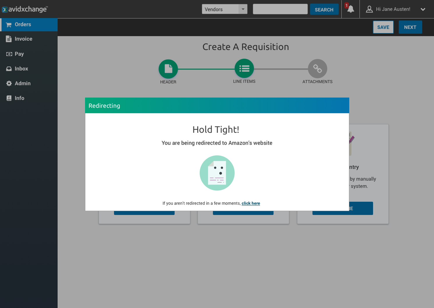
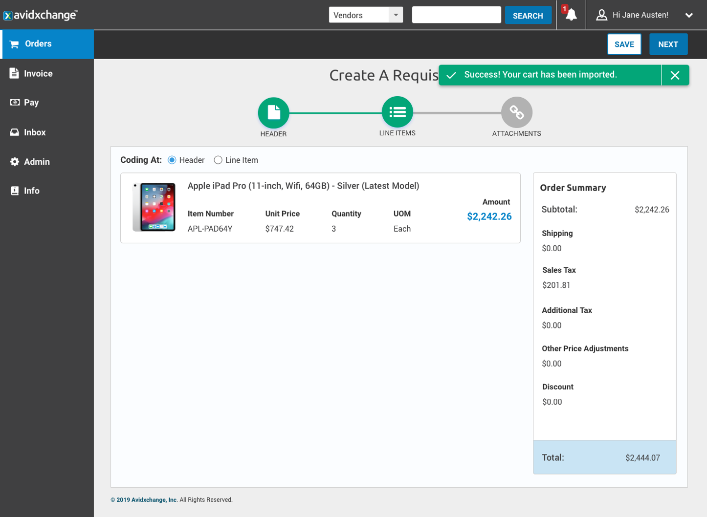
•User test a proposed workflow on a new feature offering, Punch Out, to inform the steps forward in regards to design and implementation
•The test is administered remotely
•Participants are pulled from the pool of the Blue Phoenix Focus group. These customers had been previously engaged in the User Interview process and expressed interest in other feedback opportunities
“Simple, clean, easy to use”
KEY FINDINGS
•How difficult or easy would you find this entire workflow to use? (7 users tested)
[The user who scored the experience a 3 (indifferent), had connectivity issues with the test itself influencing the rating.]
WHAT DID OUR USERS SAY?
‘I Like the path, the flow, at the top. I can tell where I am at.’
Confusion around the ‘next’ and ‘save’ button. Can I really go forward without doing anything on this screen?
‘I would like to see the little icon dancing on the redirect page.’ ‘How quickly can we get this? We needed it like yesterday.’
Some users concerned over having coding at this level while others wondered what it looked like
Would like verbiage detailing they are returned to Avid after checkout on vendor’s site
The Blue Phoenix Requisition Workflow with Punchout Prototype can be viewed here.
The Blue Phoenix Mobile Requisition Workflow with Punchout Prototype can be viewed here.
This project switched direction at the beginning of 2020. The Blue Phoenix Phase II Page has additional details on that transition and new user experience currently being implemented in a different product.


